Check out the new and improved Treat Me package we made.
The user’s impression of the product packaging has a significant role in determining whether or not the user will choose to purchase the goods.
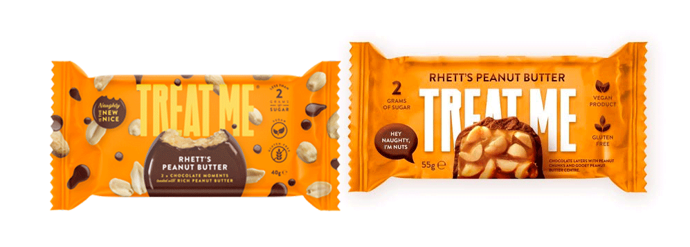
We found various issues with the Treat Me product’s original packaging.
1. The initial design featured a chocolate and nut motif. Although the peanuts and chocolate concept is conveyed, the whole composition suffers from a lack of coherence and clarity.
2. the package’s background was too busy to allow the viewer’s focus to remain on the foreground, which made it challenging to see the text.
3. there is a need to increase the contrast between the background and the text. It’s not easy to spot a lot of facts that could be used as marketing points.
4. It was tough to stick in people’s minds.
Users’ attention spans are shorter than ever before in the age of instant gratification. The primary focus of TheAd is to ensure that the product is top-of-mind and that customers want to make a purchase in a timely manner. As a result, we’ve made the adjustments below.
1. simplify the design by removing extraneous details and positioning the peanut butter and chocolate element in the middle. The new design is more aesthetically beautiful than the old one, and it also helps clients focus on the core of the product so they can quickly grasp what it’s about.
2. Adjust the font and background of the Treat Me brand name. The original brand’s name was yellow, which makes it forgettable and hard to stand out. We made the brand name bigger and whiter and moved it to the back of the package. This was the first opportunity for the customer to become familiar with the TREAT ME brand and its products.
3. Bring attention to some additional key points. We brought attention to data that would otherwise be obscured by the pattern, the font, and the typography by alternating between these three approaches. For instance, it has no animal products, no gluten, and only 2 grammes of sugar. We made these characteristics and benefits of the product easy to spot so that customers could see them right away.
4. The brand’s unique character should be emphasised. To make things more conversational, we used a dialogue box. The slogan “Hey Naughty, I’m nuts” is a clever way to draw attention to the product’s contents while also capturing the product’s playful spirit.
The design of a product’s packaging does more than only state the product’s main message; it can also affect the positioning of the brand, consumers’ expectations of the brand, and the company’s subsequent marketing communication. Packaging design is a crucial aspect of visual marketing and has a direct impact on sales.
Get in touch with TheAd so we can discuss how to improve your service or product.