


Clear-Cut and Consistent: Creating the KMH Website
People in the staffing solutions industry are always busy. Their time is precious, and a minute lost on something unimportant can add up to a loss in profits. This is something we incorporated into the KMH website, making the website straightforward and clear-cut while still keeping it informative.
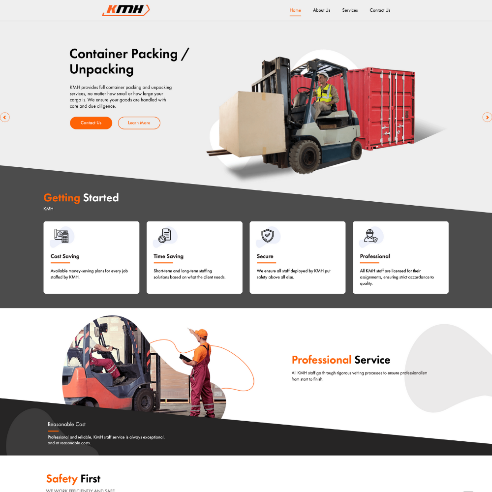
The KMH website is simple and elegant for good measure. The simple design lies in the fact that KMH doesn’t want their clients to spend time navigating through a website only to find nothing. The clear white space makes it look cleaner, pushing visitors to focus on the important parts of the website. It is also optimised for mobile, so those who search for it can view the website on the go, whether on a smartphone or a tablet.
This was only possible because of the consistent communication between KMH and TheAD. This allowed us to develop drafts quicker, noting what they wanted and precise edits on small things that mattered.
All content was provided by TheAD, so KMH did not need to worry about the text on the website. All KMH did was to fill in our form that provided enough information needed for us to create a website. The form is quite simple to fill in. The form will ask questions like what pages you want to put on the website, what message you want to convey and the main features of the business you want to emphasise.
Other websites that we’ve done include Forte Fitness, Honza’s Grill, Multi Trade Solutions, and Visual Advertising Solutions.
So if you want a cutting-edge website that is packed with information but tones down on unnecessary elements like KMH did, or a highly dynamic website with full 3D animations like Visual Advertising Solutions, you can fill in this form or contact us and one of our account managers will be in touch soon.


